Case Study
UPPAWS

My Role
End-to-end UX/UI Designer
Tools
Figma
Project Brief
Uppaws is a vet app that aims to help pet owners to have a more
easy and personalized veterinarian experience.
The target are pet owners, particularly those who don’t want to
wait in lines and/or prefer a more digital method to book, pay and
save medical information.
Challenges & Solutions
Challenge 1:
Facilitate appointment access without waiting in lines
Solution 1:
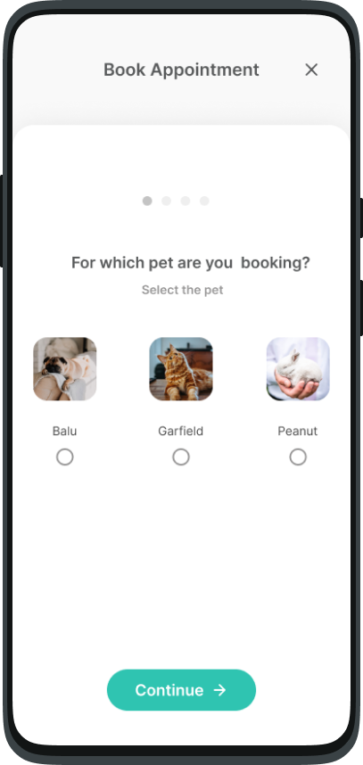
Step-by-step appointment booking
– A simplified, step-by-step process lets users book
appointments quickly and efficiently, eliminating the need to
wait in long lines and enhancing their overall experience.
Challenge 2:
Provide access to pet's Medical History
Solution 2:
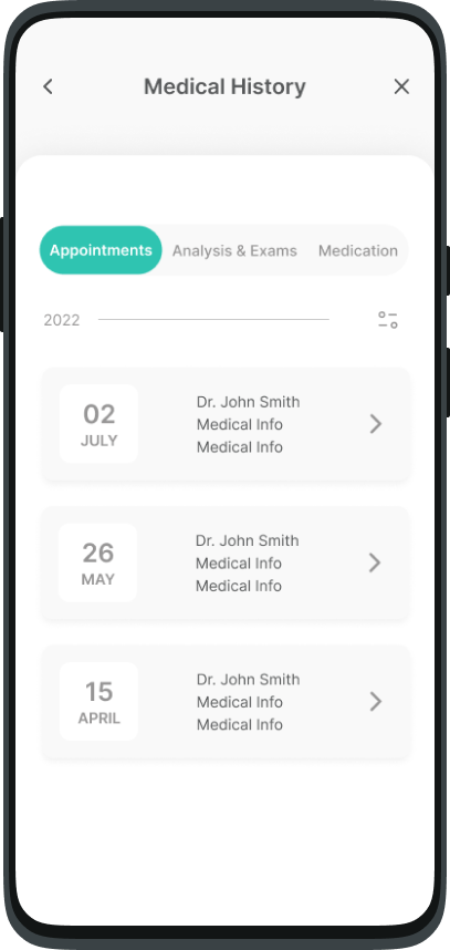
Comprehensive Medical History page – This page offers users easy access to their pet’s complete medical history, including appointments, test results, exams, and medication, all organized in one place for convenience.
Challenge 3:
Reduce the costs without directly interfering with the prices
Solution 3:
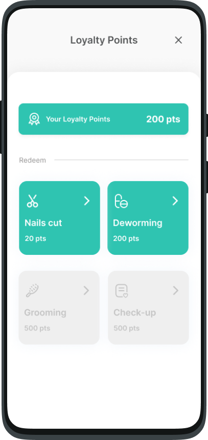
Loyalty points system for cost reduction
– Users can earn loyalty points through engagement, which they
can redeem for services, effectively lowering costs without
altering product or service prices.
Empathize
Understanding the User & Insights
During the empathize phase of my project, I conducted unmoderated
remote interviews and utilized empathy maps to gain a deeper
understanding of the users I am designing for and their specific
needs.
What did I find?
Based on the research findings, the identified user groups consists
of busy pet owners who are unable to dedicate time to waiting in
lines and pet owners who occasionally choose to visit alternative
veterinary clinics either for convenience or due to financial
considerations. However, one key challenge faced by this group is
the unavailability of their pets' medical history when visiting new
veterinary clinics.
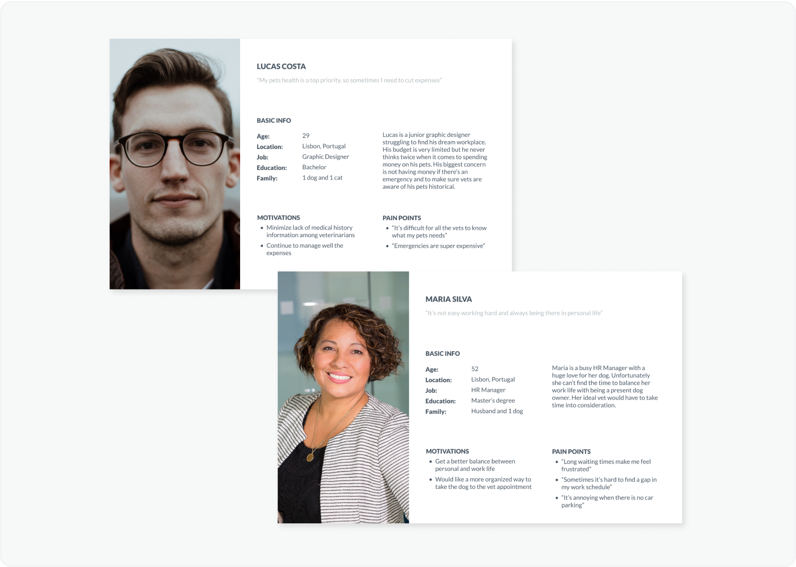
The two personas I created
Personas
Based on the interviews, and with the help of empathy maps, I created two personas and their User Stories.
User Journey Map
I mapped out the users’ steps to see how I could simplify their journey to help them reach their most important goals with the product.
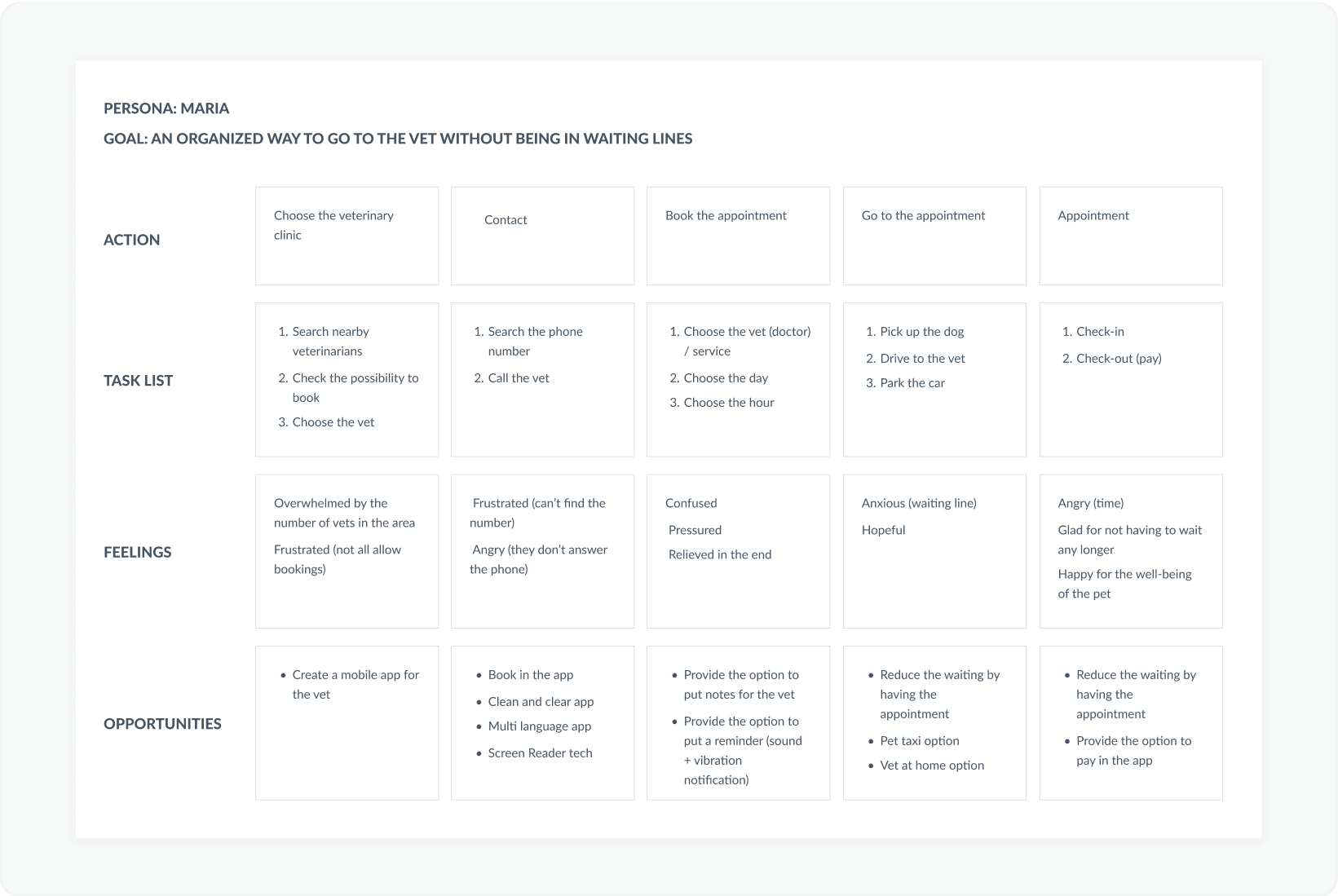
Maria's user journey
Define
PROBLEM STATEMENTS
In the define phase I created Problem Statements for a clear description of user’s needs that should be addressed
- Lucas is a Junior Graphic Designer who needs a way to reduce the lack of medical information between vets because he sometimes switches veterinarians
- Maria is a HR Manager who needs an organized and easy way to go to the vet with her dog because she loses a lot of time in waiting lines
Ideate
Competitive Audit
Entering in the ideation phase of the design thinking process, I first focused on conducting competitive audits - to know the successes and failures of my competition and to understand gaps in the market - and outlined the user flow.
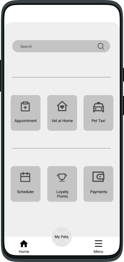
For the home screen, I prioritized quick and easy actions to help users save time.
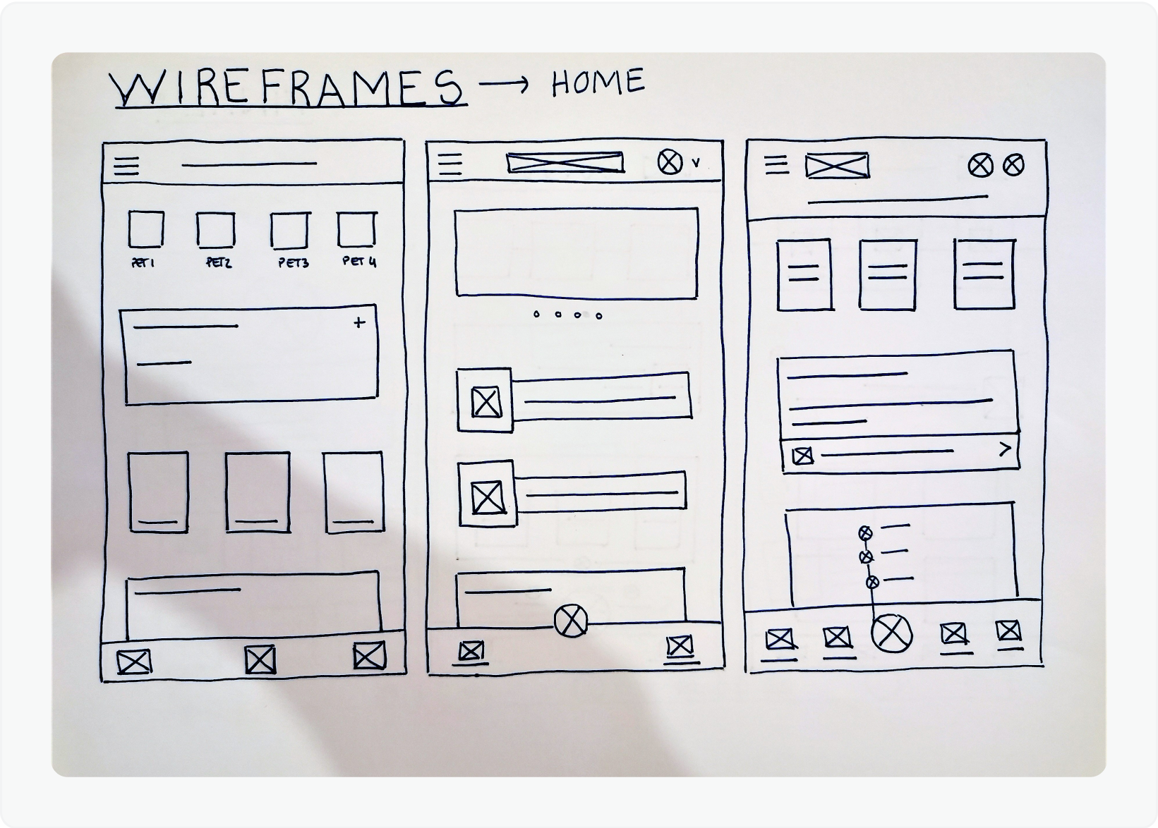
Sketches
I always start with storyboards and then paper wireframes.
Paper Wireframes are a quickly way to create and explore many
design options before I create digital wireframes.
I drafted 5 versions of each screen of the app on paper to
ensure that the elements would be well-suited to address users
pain points.
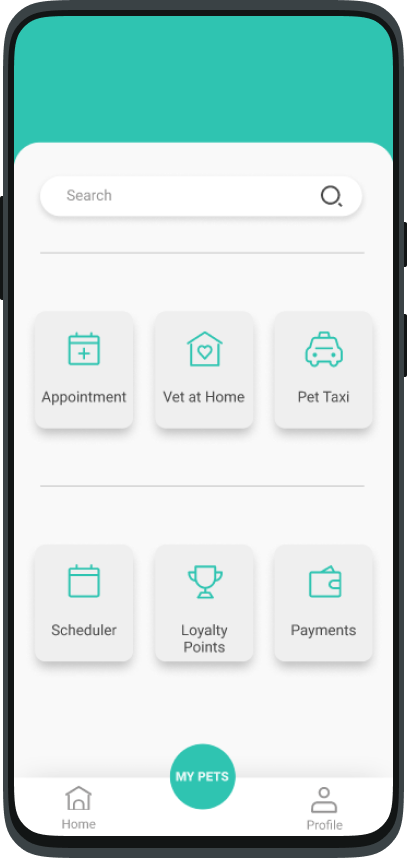
Digital Wireframes
For the Home screen I intended to put all the quick actions a
pet owner might need and leave longer actions such as Medical
Information on other screens.
For the Pet Profile screen I intended to put all the actions
related with pet’s information.
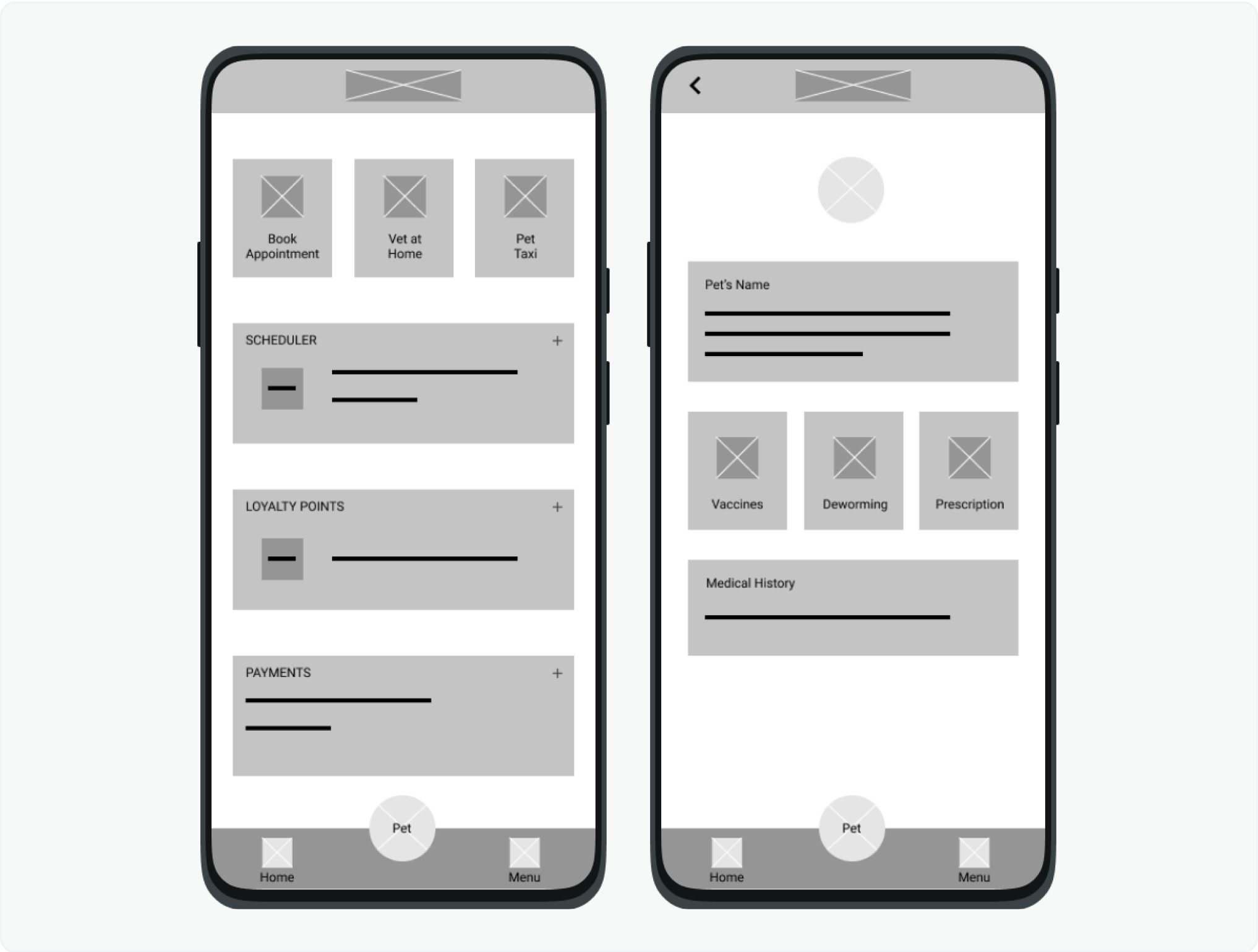
Digital wireframes
Prototype
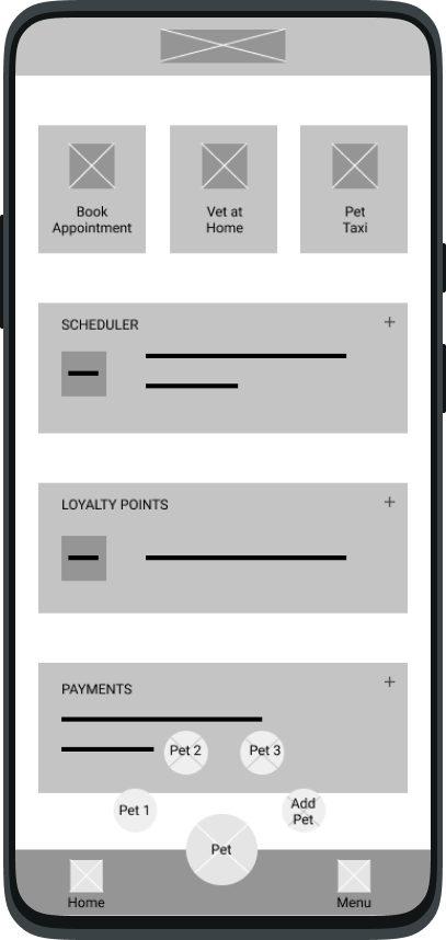
Preliminary low-fidelity prototype
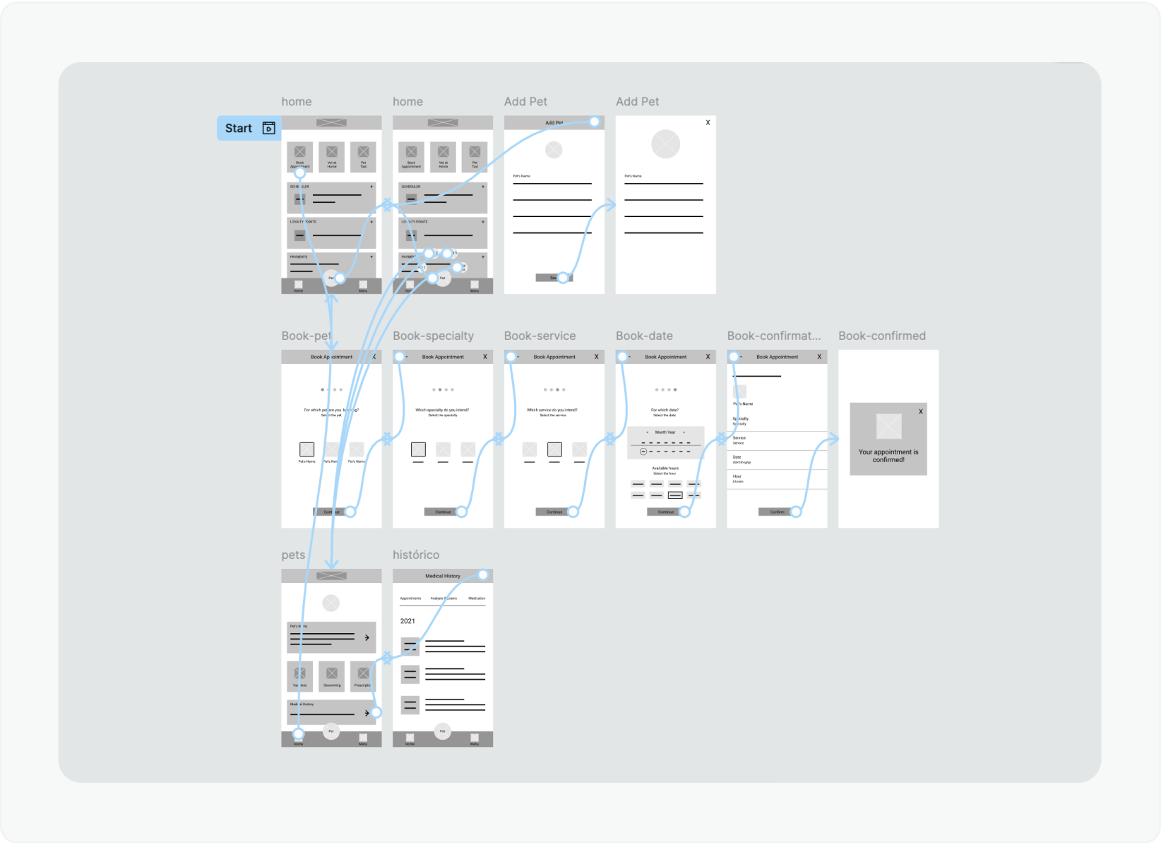
Low-Fidelity Prototype
Using a part of digital wireframes, I created a low-fidelity prototype.
The primary user flow I connected was booking an appointment and creating a pet profile, so the prototype could be used in a usability study.
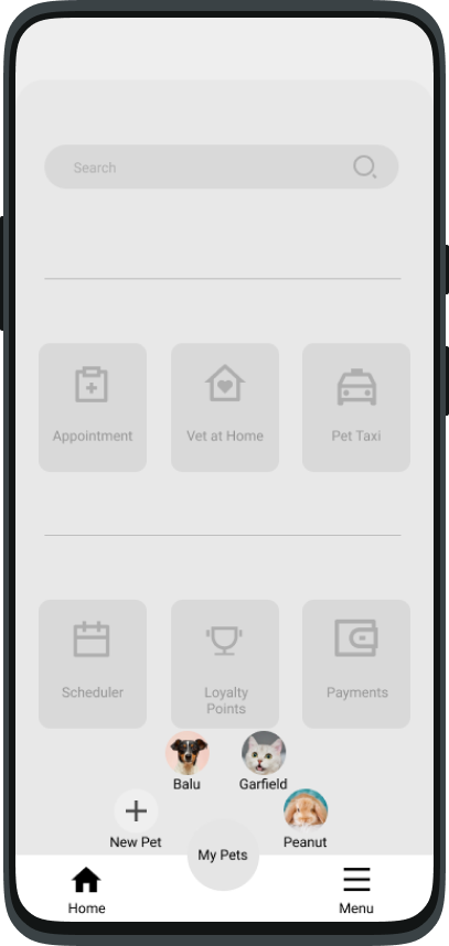
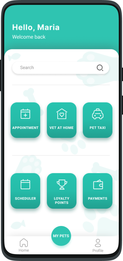
High-Fidelity Prototype
After conducting the initial usability study, I created mockups
based on the earlier findings. These mockups served as the
foundation for developing high-fidelity prototypes, which
accurately represent the final product in terms of visual design
and functionality.
After the second usability study I revised all the project,
remade the Design System and created a new final high-fidelity
prototype.
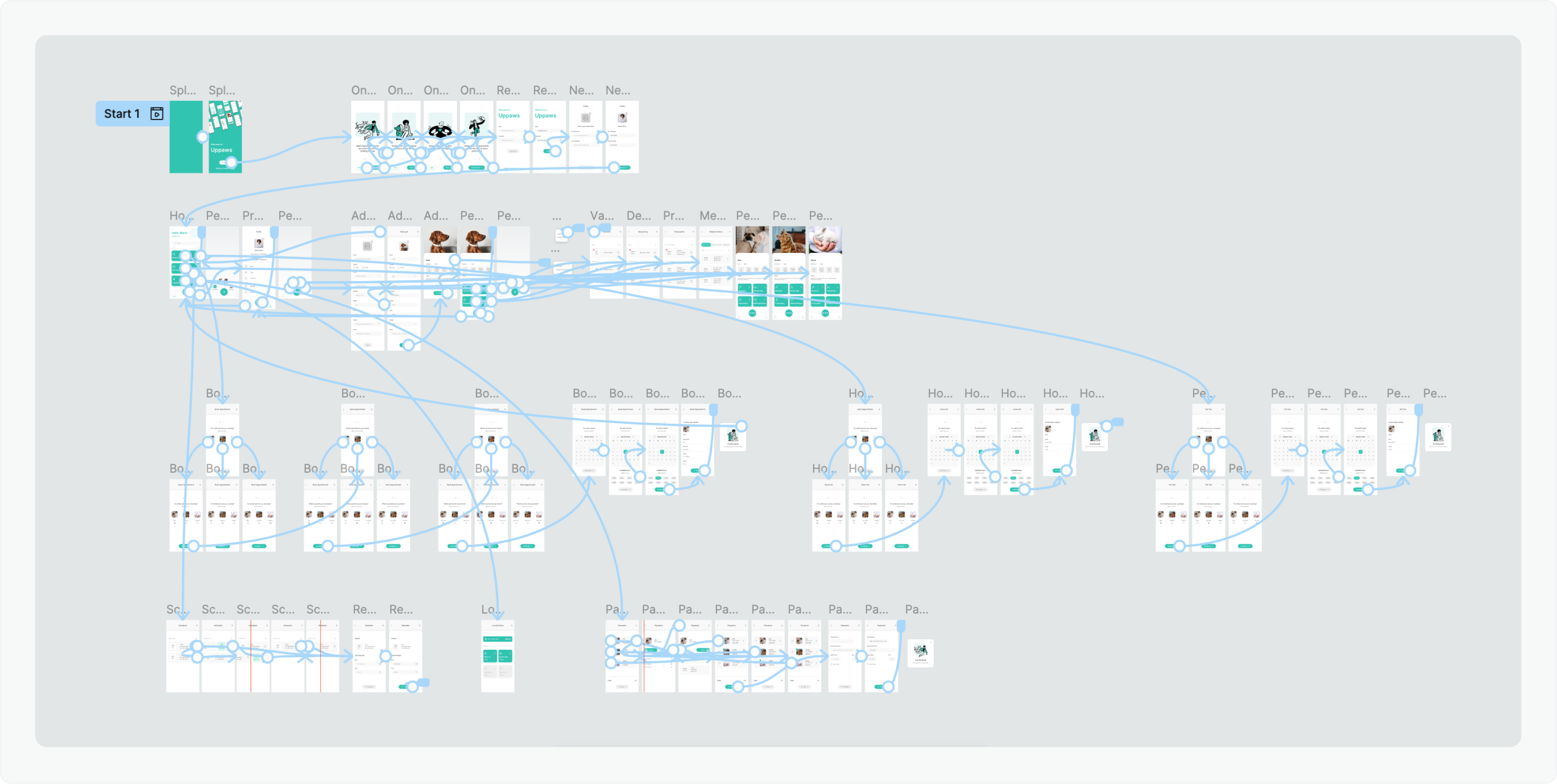
Final High-fidelity prototype
Test
Usability Studies Findings
I conducted two rounds of moderated usability studies, with 5 participants each (all pet owners):
- Findings from the first study helped guide the designs from wireframes to mockups
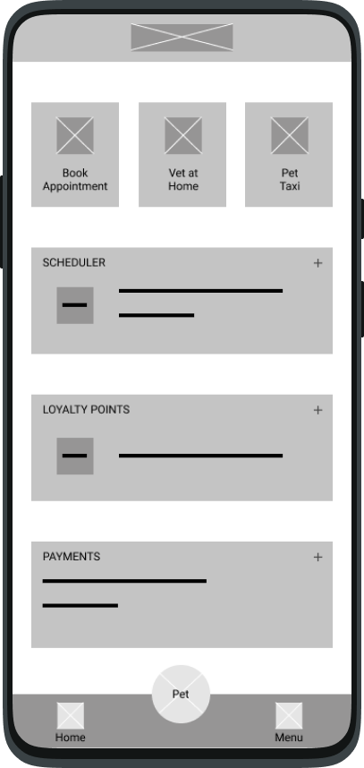

It wasn't clear what the “Pet” button did
The whole page wasn't clean and clear enough
Didn't provide a quick access to what the User wanted to find
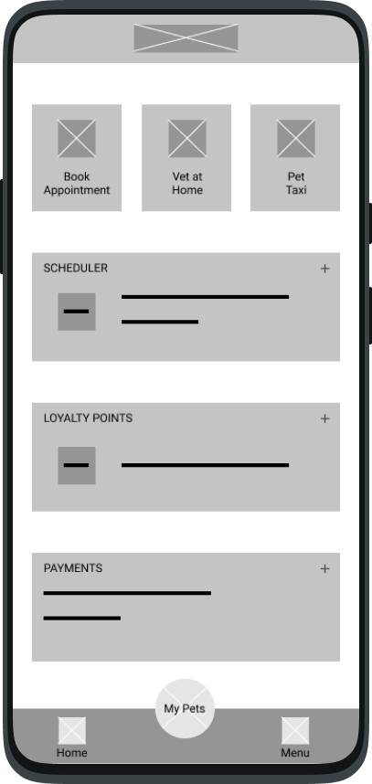
Final Wireframe
The button to add a new pet wasn’t clear enough and should be on the left side, because it’s the side users first look at
The structure wasn’t well done
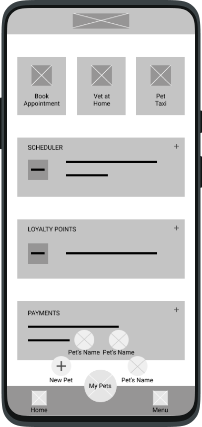
Page looked confusing. Needed a clearer way to separate layers
Final Wireframe
- The second study with the high-fidelity prototype revealed what aspects of the mockups and prototype itself needed refining
The name "Menu" was no longer appropriate for the function
More accessible buttons
Design and prototyping refinement
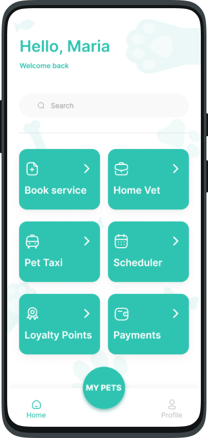
Final Design and Prototype

Takeways & Final Design
For this project, my goal was to design a solution that would not
only support veterinarians but also empower pet owners, who are the
primary users. During the research phase, I uncovered three key pain
points: time, access to medical information, and cost. These
findings validated my initial assumptions and became the foundation
of the app’s design.
To address these challenges, I designed an app that:
- Saves time by enabling efficient appointment scheduling and reducing wait times;
- Centralizes medical information so users can easily access exam results, appointment reports, and vaccination records;
- Offers financial incentives with a loyalty points program to help pet owners reduce expenses on their pets’ care.
Opportunities for Improvement
With more experience, I recognize accessibility as a key area for
improvement. If I were to revisit this project, I would:
- Redesign components to improve accessibility by ensuring they meet key accessibility principles. For instance: Tabs and Buttons would have sufficient color contrast and clear visual feedback (e.g., hover and focus states) to assist keyboard and screen reader navigation; Text fields would be enhanced with visible and descriptive labels, clear error messages, and help text to guide users through the input process.
- Simplify the user flow to create a more inclusive and intuitive experience for users with diverse needs.