Case Study
DORG

My Role
End-to-end UX/UI Designer
Tools
Figma
Project Brief
Dorg is a dog food brand that aims to make it easy for pet owners
to provide healthy, organic food for their dogs without any
worries. The goal is to offer food plans that cater to the unique
dietary needs of each dog, ensuring that they receive the
nutrients they need to thrive.
Understanding that pet owners
lead busy lives, the Dorg approach is designed to simplify the
buying process by offering personalized food plans and a delivered
to their door on a schedule that works for them.
Challenges & Solutions
Challenge 1:
Make dog food shopping more convenient and flexible – Users struggle with deliveries that don’t fit their routines, difficulties in carrying heavy food bags and limited options for exchanging or returning items in-store.
Solution 1:
Flexible delivery plans and order tracking
– Users can choose between monthly, weekly, or one-time purchase
plans, customizing delivery frequency, preferred week, day, and
time slot. A tracking system ensures they stay informed about
their order status.
Challenge 2:
Improve product discovery and selection experience – Users face navigation difficulties on other dog food websites, lack guidance in choosing the right food and can’t preview details like kibble size.

Solution 2:
Personalized recommendations through pet profiling – A step-by-step system helps users create a pet profile, allowing for tailored food suggestions based on their dog’s needs. Detailed product descriptions, including kibble size, provide more transparency and confidence in their selection.
Empathize
Understanding the User & Insights
During the empathize phase of my project, I conducted unmoderated
remote interviews and utilized empathy maps to gain a deeper
understanding of the users I am designing for and their specific
needs.
What did I find?
Based on the research findings, the identified user groups consists
of busy pet owners who are unable to dedicate time to waiting in
lines and pet owners who occasionally choose to visit alternative
veterinary clinics either for convenience or due to financial
considerations. However, one key challenge faced by this group is
the unavailability of their pets' medical history when visiting new
veterinary clinics.
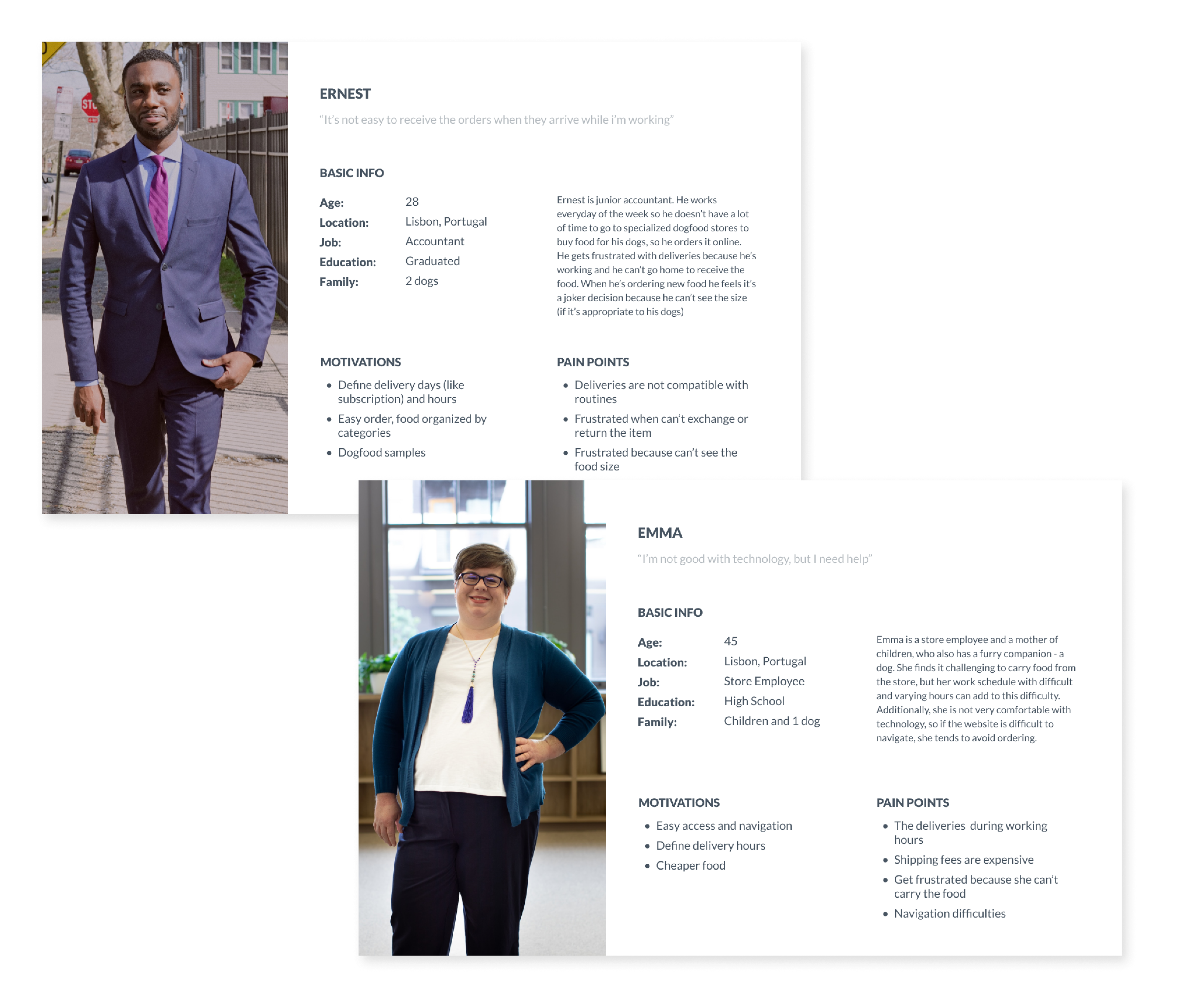
The two personas I created
Personas
After conducting interviews and building empathy maps, I developed two distinct personas and crafted their corresponding user stories. This process allowed me to gain a deeper understanding of the user's pain points and motivations, and helped with the direction for further design decisions.
Define
PROBLEM STATEMENTS
In the define phase I created Problem Statements for a clear description of user’s needs that should be addressed
- Ernest is a busy accountant employee who needs a convenient online platform to order dog food that provides comprehensive product specifications, because he has a limited availability due to his demanding work, making it challenging for him to find the time to research and physically visit pet stores for suitable dog food options.
- Emma is a store employee who needs an easy access and clear solution for purchasing dog food with scheduled home deliveries, because she struggles with technology and is unable to carry heavy bags from physical stores. Additionally, she requires the ability to set specific delivery schedules due to her demanding work schedules.
Ideate
Competitive Audit
During the ideation phase of the design thinking process, my initial focus was on performing competitive audits to gain insights into the successes and failures of my competition. This approach allowed me to identify gaps in the market and develop a clear understanding of the user flow, which served as a foundation for further design exploration.
Sitemap
To best meet my user’s needs, I organized content, defined the structure and built a hierarchical sitemap.
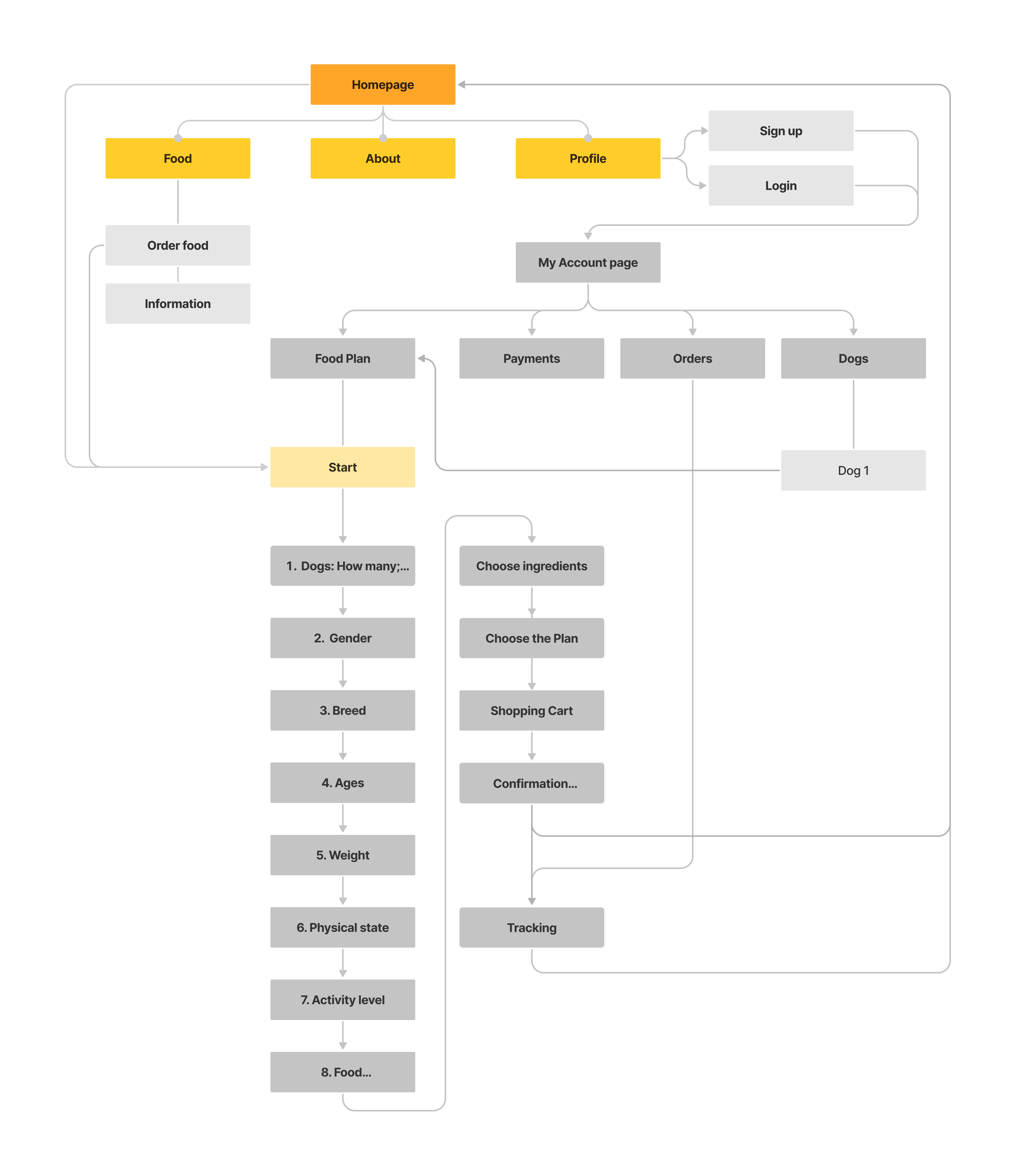
Dorg’s sitemap
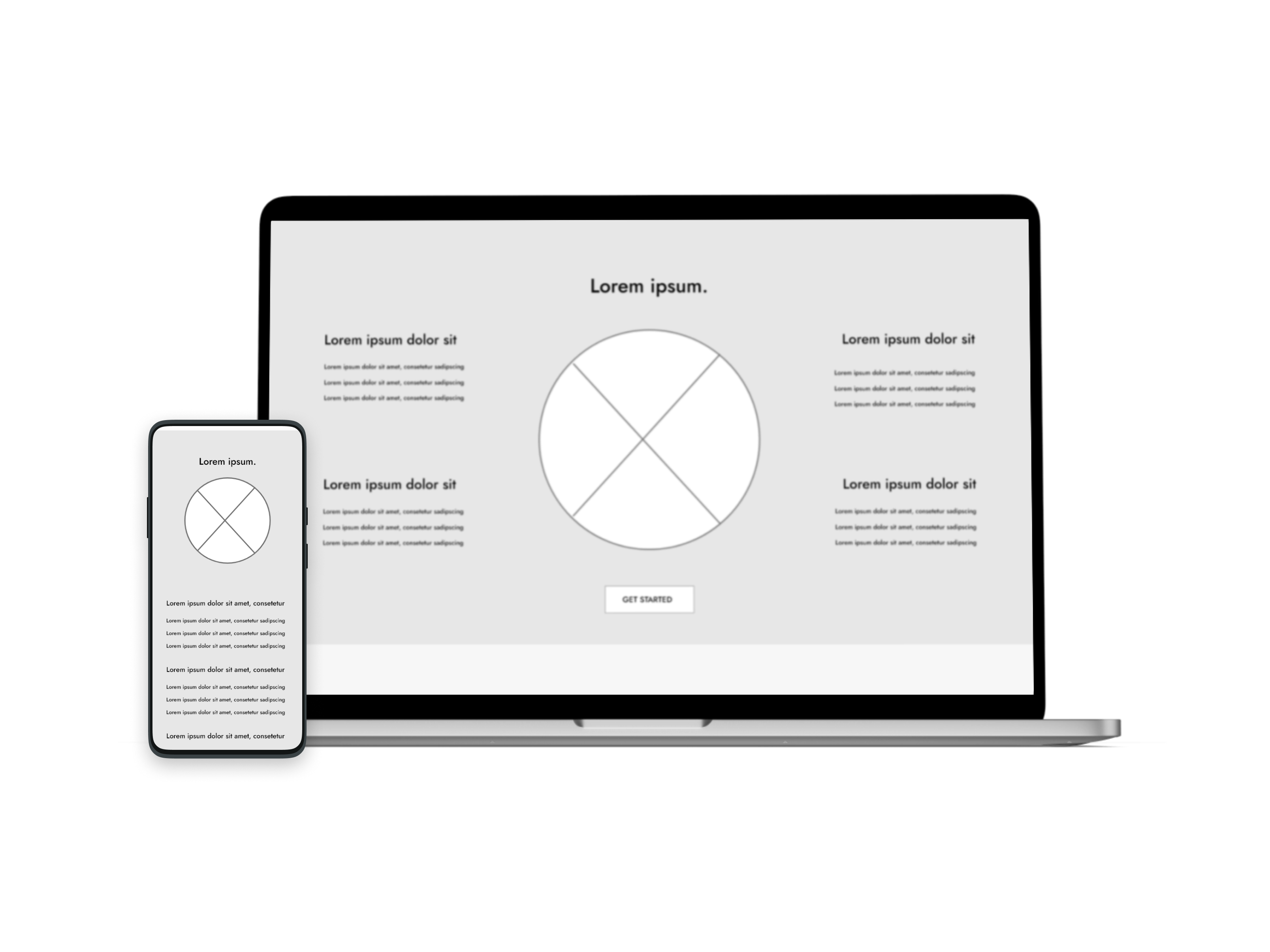
Home page
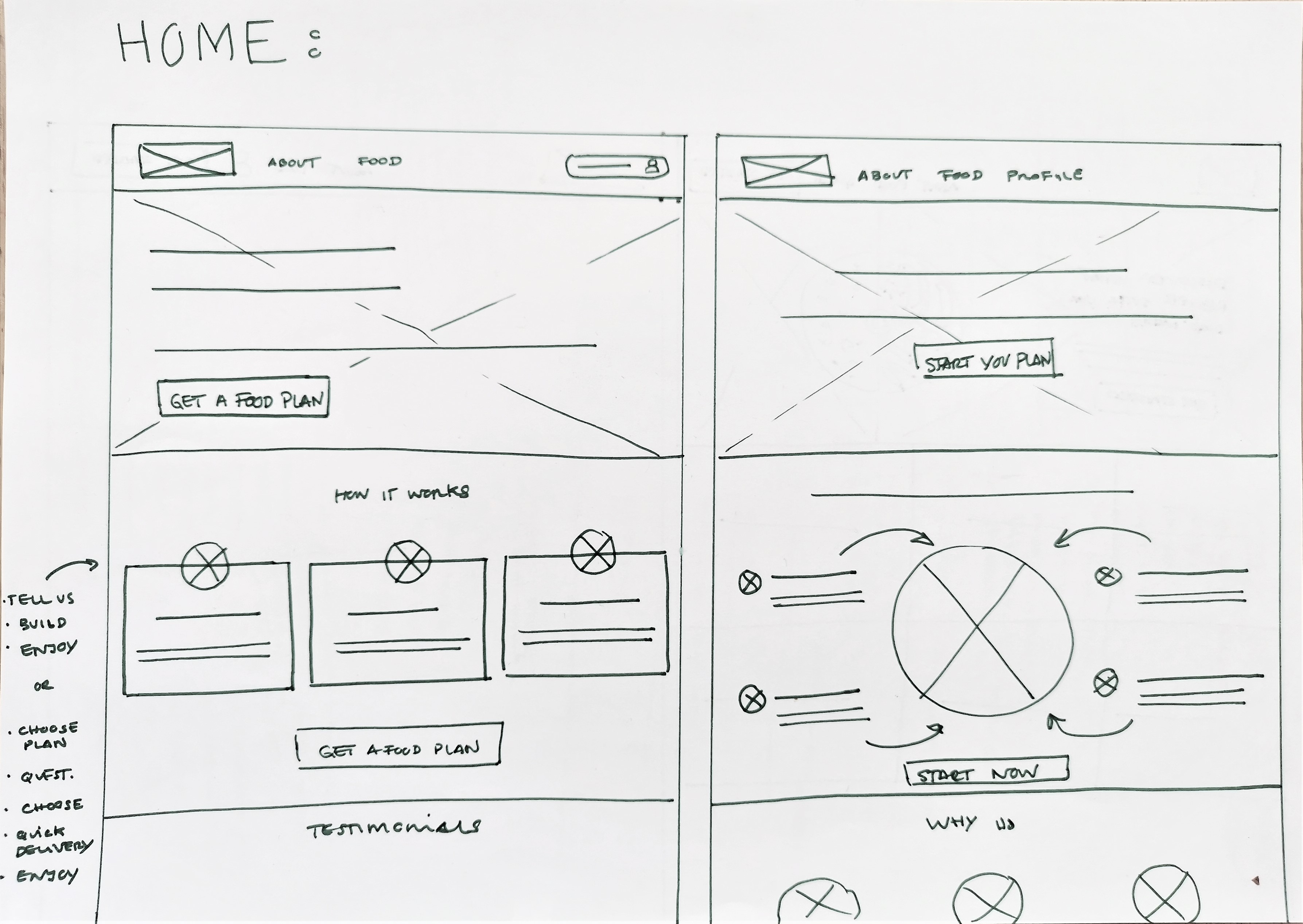
Sketches
To begin my design process, I always start with storyboards to visualize the user's journey through the website. Following that, I create paper wireframes, which allow me to quickly explore various design options before moving onto digital wireframes.
To achieve the goal, I drafted five different versions of the Home page, carefully considering each design element and ensuring that it was well-suited to address the user's pain points.
Digital Wireframes
To enhance website usability and drive user engagement, I
strategically incorporated prominent call-to-action (CTA)
buttons across almost all sections of the pages.
The primary focus was to encourage users to initiate their dog's
food plan. By placing these CTAs in visible locations, I ensured
effortless navigation to the form where users could begin
creating their personalized dog’s food plan. This streamlined
approach simplified the process and effectively guided users
towards achieving their goal.
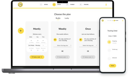
Prototype
High-Fidelity Prototype
I translated the insights from the usability study into mockups and further refined them into high-fidelity prototypes, capturing the desired visual design and interactive elements.

Final High-fidelity prototype
Test
Usability Studies Findings
I conducted one round of moderated usability studies, with 5 participants each (all pet owners):
- Users suggested adding more clarity.
- Some users found the "back to home" button confusing.

Takeways & Final Design
Through this project, I gained a deeper understanding of how
simplicity impacts design. By focusing on users' needs and removing
unnecessary complexity, we can create intuitive, efficient solutions
that align with their goals. Simplicity isn't about stripping away
functionality—it’s about carefully curating every element to enhance
usability and effectiveness.
Another key takeaway was the importance of following a structured
design process. From conducting research to prototyping and testing,
each phase helped uncover insights that directly informed design
decisions, reinforcing the value of iteration in creating meaningful
experiences.
Next steps
If I were to revisit
this project, I would:
- Conduct a second round of usability studies to identify any issues or areas of confusion with the updated design, gathering direct user feedback through observation and interaction.
- Analyze the feedback to pinpoint any remaining pain points and make adjustments, focusing on streamlining the user flow further and enhancing accessibility.


